Visualize data in reports
Learn how to analyze the data visualized in iCenter reports.
iCenter reports present equipment maintenance and utilization information to enable you to make data-driven decisions and improve operational results in healthcare.
Available reports
Visualize equipment business metrics in reports
Reports in the business review category provide information on asset distribution and service metrics to support inventory planning and periodic reviews.
Visualize equipment maintenance in reports
Reports in the maintenance category help you to manage planned maintenance, monitor service activity, and measure performance.
Visualize equipment utilization in reports
Reports in the utilization category provide information on volumes of diagnostic imaging exams, status of whether system is enabled and sending data, and other metrics across time, compared to benchmarks.
Report types
| Visualization type | Example | Description | Used in reports |
|---|---|---|---|
| Area chart | 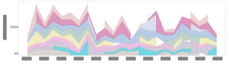 |
Compare two or more sets of data to show trends among related attributes over time. The shaded areas under lines indicate the volume of change for each value relative to the cumulative total. |
|
| Bar chart | 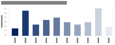  |
Compare data across categories to show trends within categories. |
|
| Calendar heat map |  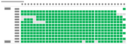 |
Compare categories of data to show activity over a span of time to illustrate how quantities vary depending on a specific point in time or how they trend over a period of time. | |
| Doughnut chart | 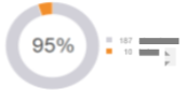 |
Displays a high-level view of percentages of a total. |
|
| Line chart | 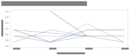 |
Connect sequential points of data to show trends over time. |
|
| Map | 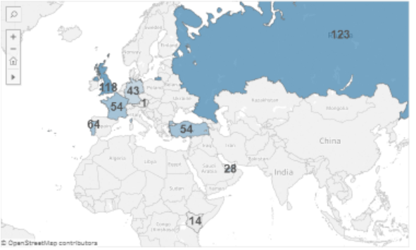 |
Displays geographic data to show distribution across locations. |
|
| Scatter plot chart | 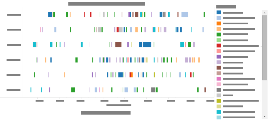 |
Compare trends, concentrations, and outliers to show the relationship among variables. |
|
| Summary table | 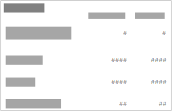 |
List data in rows and columns to summarize data in tabular format. |
|
| Tree map |  |
Illustrate hierarchical data as a proportion to the whole using a series of nested rectangles. |
Report data selection
To select more than one item in a report chart:
- Click the first item, hold down the Ctrl key, and click any additional items to be included.